
Eyemaxxing: Colors That Make Your Eyes Pop
Use the colors already inside your iris as the starting point, then choose whether to contrast them or echo them.
What eyemaxxing means here
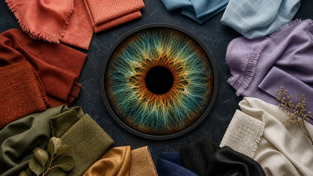
Eyemaxxing is a broad internet term, but this guide uses it in one practical, non-medical sense: choosing nearby colors that make the visible colors in your iris easier to notice. Clothing, makeup, hair, glasses, jewelry and photo backgrounds can all change which iris shades stand out first.
The goal is not to change your eyes or assign them an attractiveness score. It is ordinary color styling: control the contrast around the face, observe the result in consistent light and keep the combinations that give your eyes the emphasis you want.
Start with your measured iris mix, not one generic label
Broad labels hide useful detail. Two people described as blue-eyed may have very different mixes of sky blue, gray, teal and amber; two hazel irises can reverse the balance between green and brown. A recommendation based only on the label treats those eyes as interchangeable when their strongest visible shades are not.
A clear, evenly lit photo can reveal the color-family percentages, leading measured shades and inner-to-outer zones that a mirror impression compresses into one word. Use that mix as the palette brief: the dominant shade tells you what already leads, while a meaningful secondary shade gives you another color to emphasize.
Choose contrast when you want your eyes to lead
Contrast separates the iris from the colors around it. The most direct move is hue contrast: place a color from another part of the color wheel near the face. Value matters too—a light iris can become clearer beside a deeper color, while a dark iris may reveal warm detail beside a lighter or brighter accent.
Strong contrast does not require a full outfit in one dramatic shade. A collar, scarf, glasses frame, eyeliner, earring or portrait background can create enough separation to change what the viewer notices first.
- Compare the candidate color with both leading iris shades, not only the dominant family
- Test the color near your face in neutral daylight before judging the effect
- Use one deliberate contrast at a time so you can see which iris shade it emphasizes
- If a near-match makes the iris disappear into the surrounding color, move farther away in hue or lightness
Use harmony for softer, more tonal emphasis
Harmony repeats a color already present in the iris. It produces a quieter effect than contrast, but it can make a secondary shade feel more intentional: olive near a green-gold iris, bronze beside an amber core, or charcoal around a gray-blue eye. The surrounding color acts like an echo rather than a spotlight.
An exact copy is not always the best harmony. If the clothing or frame is too close to the iris in hue, lightness and saturation, the eye can blend into it. Try a lighter, darker or slightly warmer version of the measured shade so the relationship is visible without becoming camouflage.
Build a practical eye-emphasis palette
Start with two measured iris shades. Add one contrasting color for high-emphasis days and one harmonious color for a quieter look. Test both across the categories you actually use—tops, frames, makeup, hair, jewelry or photo backgrounds—and photograph the result in the same light so the comparison is fair.
Eye color alone is not a complete seasonal color analysis. Skin undertone, hair color and overall contrast still affect which colors flatter your whole face. Treat the iris palette as a focused tool for eye emphasis, then cross-check it against the rest of your coloring and your own preference.
- Keep the photo conditions consistent when comparing colors
- Save the combinations that work instead of relying on color names from memory
- Recheck mixed eyes when you want to emphasize a different zone, such as green instead of gold
- Use an item-color checker to compare a garment, frame or background with both leading iris shades
Stop guessing — measure it
Photo-based color percentages, rarity score, and a shareable Iris Card in 60 seconds. Private: your photo never leaves your device.
Analyze My Eye Color FreeFrequently asked questions
What is eyemaxxing?
Eyemaxxing is an internet term for making the eyes more visually prominent. In this guide it means color styling only: choosing clothes, makeup, hair, glasses, jewelry and backgrounds that contrast with or echo the visible shades in your iris.
What color makes my eyes pop the most?
There is no single answer for every broad eye-color label. The strongest choice depends on your dominant and secondary iris shades: contrast creates the most separation, while harmony selectively reinforces a color already present. A measured mix is more useful than choosing from the label alone.
Do I need makeup to make my eyes stand out?
No. A top, collar, scarf, glasses frame, earring or photo background sits close enough to influence how the iris reads. Makeup is one option, not a requirement.
Is eyemaxxing the same as seasonal color analysis?
No. Eye-emphasis styling asks which nearby colors highlight your measured iris shades. Seasonal color analysis considers the combined effect of skin undertone, hair, eyes and overall contrast. Your iris can inform that process, but it cannot determine a complete season by itself.
Should I use contrast or harmony for my eye color?
Use contrast when you want the eyes to become a stronger focal point; use harmony when you want a softer, coordinated result or want to bring forward a secondary iris shade. Most useful palettes include both options.