Prepared by
Northlight Iris Studio
Your Iris Color Story
Personal color style profile
Avery Example
Your exact color palettes
Measured iris colors
- 30%
- 26%
- 22%
- 14%
- 8%
Contrast palette
Harmony palette
Accent palette
Color family breakdown
- Sky blue74%
- Gray18%
- Amber8%
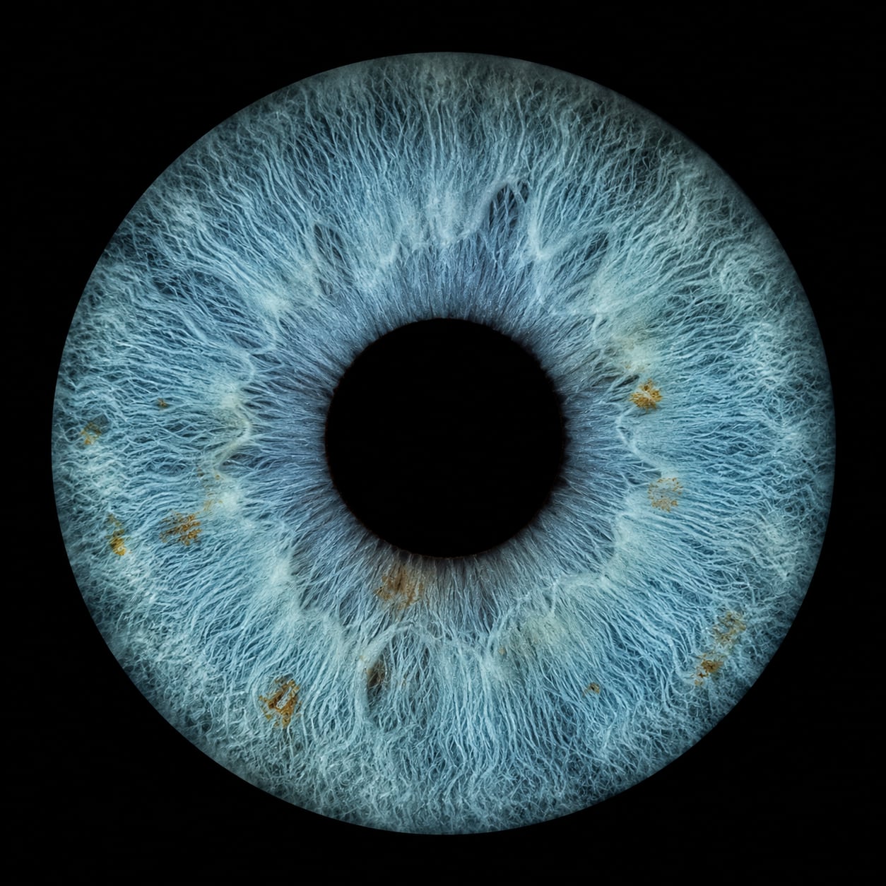
Your dominant iris colors
Selected to emphasize the colors measured in your iris. Your iris layers cool slate blue and soft gray-teal fibers around a ring of warm amber flecks near the pupil — a naturally balanced palette of calm base tones with small, bright moments of warmth.
Slate Blue
The strongest measured tone. Wearing it near the face lets the whole iris palette read as intentional and put together.
Coastal Teal
A lighter measured mid-tone that works well in knits, shirting, and scarves when a full slate look feels too deep.
Deep Harbor
The darkest measured shade. A strong alternative to black for jackets, coats, and frames on days you want more softness.
Sea Glass
The palest measured tone. Useful as a near-neutral base layer that keeps the deeper blues from feeling heavy.
Amber Fleck
The warm accent measured close to the pupil. Small doses — a watch strap, a stitch detail — echo it without competing.
Styling recommendations
Wearing contrast
May create visual contrast. Warm, low-saturation earth tones sit opposite the measured blues, so placing them near smaller details gives the eyes a clear stage without overwhelming them.
A muted camel that mirrors the amber flecks; strongest in textured fabrics like suede or wool.
A soft sienna for autumn layers; keep it below the shoulders when you want the iris blues to lead.
A pale honey tone that lifts the deep harbor blue in color-blocked outfits.
Wearing harmony
These related hues stay inside the measured cool family, extending the iris palette quietly for one-tone looks and layered outfits.
A bridge tone between slate blue and deep harbor for suiting.
A softened teal for shirts and fine knits worn near the face.
A misty blue that works as this palette’s version of white.
Wearing accents
Small, deliberate accents keep the look lively: one warm metallic or one saturated pop per outfit is enough to make the measured colors feel designed.
A brushed gold accent that matches the amber ring’s warmth.
A muted plum that adds evening depth without leaving the cool family.
A sea-green accent for spring layers; echoes the teal fibers.
Clothing
Near the face, stay cool
Collars, scarves, and knitwear in slate blue, coastal teal, or misty blue keep attention moving toward the measured iris colors.
Deep harbor instead of black
For tailoring and outerwear, the darkest measured shade reads richer against this palette than true black.
Warm tones below the shoulders
Camel and sienna work best in trousers, skirts, belts, and bags, where they frame rather than compete.
One accent at a time
Choose a single gold, plum, or sea-green accent per outfit so the base palette stays legible.
Eyewear
Matte slate or gunmetal frames
Low-shine cool frames repeat the measured base without reflecting it away.
Amber tortoise details
Tortoise temples or bridges echo the amber flecks measured near the pupil.
Avoid heavy high-gloss black
It can flatten the palette; deep harbor or graphite keeps more depth.
Makeup
Taupe and stone neutrals
Soft taupe lids let the measured blues carry the color story on their own.
Bronze as the warm note
A fine bronze liner or shimmer picks up the amber ring for evening looks.
Keep cool tones matte
Matte slate or charcoal liner defines the eye without competing shine.
Hair
Ash and neutral depths
Ash brown and cool espresso backgrounds make the iris palette look deliberate.
Subtle warm ribbons
If adding warmth, thin caramel ribbons echo the amber flecks better than allover gold.
Avoid brassy allover tones
Strong orange-gold fields can outshine the measured amber accent.
Jewelry
Brushed gold in small doses
A thin brushed-gold piece repeats the amber ring; polished silver suits the cool base.
Stones from the palette
Labradorite, aquamarine, and smoky topaz sit naturally inside the measured range.
Mixed metals, one lead
When mixing, let one metal clearly lead so the accent stays deliberate.
Photography
Deep neutral backdrops
Charcoal, deep harbor, and stone gray backgrounds make the measured blues glow in portraits.
Soft directional light
Window-style light at a slight angle keeps the amber ring visible without hotspots.
Echo one wardrobe color
Repeating a single measured tone in clothing ties portrait sets together.
Colors to use carefully
Neon and high-saturation warms
Bright orange and neon coral can overpower the soft measured contrast; keep them away from the face.
Large fields of yellow-green
They can dull the teal fibers; prefer the sea-green accent in small doses.
Pure optic white near the face
Misty blue or ivory reads softer against this palette than stark white.
This report is for visual color styling only. It is not medical, diagnostic, psychological, or biometric analysis.
Consider alongside your skin undertone and natural coloring. This profile describes relationships between clothing, accessory, and environment colors and the colors measured in your iris photograph. It is a styling reference for this palette, not a complete seasonal color assessment.